

Creating Inclusive Digital Content by David O’Donnell
David O’Donnell is a Data Fellowship Apprentice at Skanska and is writing for the Community Blogging Team.
A Civil Engineer with 8+ years of experience looking to encourage others into the world of Data Analytics. I aim to write informative articles on how to learn new topics, personal growth and being part of the wider Data community .
Delivering information that is inclusive to all needs to be a business requirement. Design of presentations, reports and dashboards should consider people with different difficulties at the beginning of the process.
Ask Yourself
Have you considered people with colour blindness in your presentations?
Have you used highly interactive presentations with flashing transitions – which may cause a seizure?
Below I have detailed on how you can create more inclusive content. Please consider this as an aide memoire, for future reference, to create inclusive content.
Bionic Reading
10% of the population has great difficulty with reading and understanding, otherwise known as dyslexia.
This form of reading known as Bionic Reading has received great feedback in allowing the reader to understand the writing easier.
It is a new type of writing style, and this paragraph is written in that style.
Colour Blind Awareness
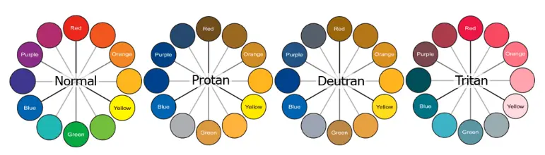
Colour blindness effects 1 in 12 men (8%) and 1 in 200 (0.5%) women in the world. Therefore, we need to consider this in the colour palettes that we use to tell a story of our data. Consider the need to use colour and what you are trying to translate in your use of colour. Below is a figure showing what people see depending on the type of colour blindness they have.
There are colour pairs to avoid when designing graphs such as:
- Red & Green
- Green & Blue
- Blue & Purple
Some colour pairs that are colour-blind friendly are:
- Blue & Orange
- Blue & Red
- Blue & Brown
Other tips when using colour in your graphs is to consider monochromatic colour sets (which is using varied tones of the same colour. When using colour consider using patterns and textures in your visuals. Try not to describe your graph based on the colour as it may not be true to all your readers.
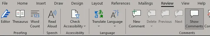
Check Accessibility
When using any of the Microsoft suite, you can review the accessibility of your content. Under the ‘Review Tab’ there is a ‘Check Accessibility’ button. This can be a great quick check on your reports and content.
Transitions and Animations
Simple transitions and ensure no flashing animations as these can induce seizures. When delivering a presentation, it is best to keep transitions simple and if flashing images/videos are required then you should include a disclaimer in your content.
Formatting
Ensure all your content is legible and easy to read. You need to consider that this is the first time someone is reading your content and may not be familiar with the content. You may also not be there to explain what is being detailed in the graph/table.
- Ensure the columns and rows have titles in your tables
- The same applied to the axis of your graphs
- Remove details from your graphs that aren’t informative
- Ensure there is a legend associated with your graphs
Hyperlinks
If you are going to insert hyperlinks into your presentations or reports. Don’t use the full website address as this sometimes doesn’t provide clarity on what the link is for. Example of an ineffective hyperlink and effective hyperlink are shown below:
Ineffective: https://community.multiverse.io/topics/24103/page/welcome
Effective: Multiverse - The Write Way Group
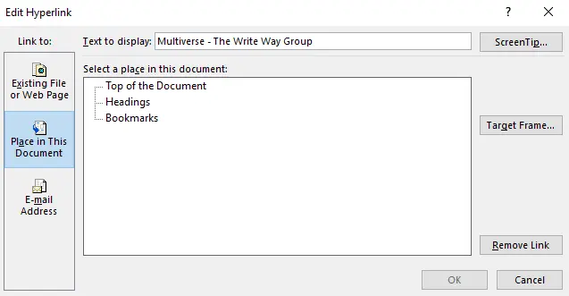
The hyperlink can be renamed by right clicking the hyperlinking, click ‘edit hyperlink and update the ‘Text to Display:’ information as shown in the image below.
Font
You should also consider the font you are using and the line spacing. People who are visually impaired need to have fonts that are at the correct size and line spacing. The following are
- 1.5 spacing between fonts
- Size 14 font is suitable for printed versions
- Good fonts to use: Arial, Calibri, Sans Serif, Tahoma, Verdana, Times New Roman
Diversity
Ensure you consider diversity in the photos you select and be conscious of the pronouns that you use.
Conclusion
All the above is not an exhaustive list of what should be considered when creating inclusive content. You need to be proactive in your design considerations. Imagine creating a suite of Power Bi dashboards for your Senior Leadership Team and then a new member joins who is colour blind? You now need to change all your dashboards to consider this.
Create inclusive content that tells a story to all your audience, even those that are not currently visible.
Here are a few resources to get you started if you’re interested:
- Book: Storytelling with Data by Cole Nussbaumer Knaflic Bionic Reading
- Online resource: Bionic Reading
If you'd like to write an article to be posted on the Multiverse Community Hub, please fill out this form and a member of the team will be in touch.